|
||||
 |
||||
How to Paint Water Reflections |
||||
Lesson 18by Mary Ann Boysen
You, as an aspiring or even professional artist are encouraged to upload images that you want to share the "how to's" and product information, or to ask for help from me and other professional artists. Some of my videos are located on Youtube so that you can see paintings in progress:
Related topic:Going with the Flow
|
||||
The first set of instructions that I am loading on this site deals with the age old problem of |
||||
How to paint WATER RELECTIONS…..a simple solution Water can look dark or it can look light. Usually when it looks dark it is because the surrounding area is light either with snow, or very wet and reflective surfaces. In this article, I will show you step-by-step how to paint a winter stream and how to paint the water reflections. creates a glare all its own when the sun skims across the surface. So, with this in mind, there are three things to remember.
The glare on the water is what causes dark objects to appear a bit lighter. The reflection of the color of the sky in the water gives light objects a bit darker appearance.Therefore the medium values remain much the same. When painting water reflections remember to keep your strokes horizontal, not convex or concave, as water seeks its level and therefore is a flat surface. You can of course, create some ripples in a zig zag fashion that make it appear as if it is moving. I begin with mixing three colors for a grey in this winter scene. To keep things simple I chose this rather monochromatic scene to show one way of creating reflections and painting water. First, I wet my paper and coat it with a warm glow of a gold and a pink. Then I dried it, mixed my blue into the gold and pink mixture on my palette to make grey. Next I painted the medium dark background above the horizon and suggested the shadows of the branches beside the stream, and at the same time, with the same wash brush I laid in the initial shape of the stream. All of this took about ten minutes or less. When painting any scene, you must use a large wash brush in order to lay in these colors without brush strokes showing. AND keep your painting surface at a TILT. 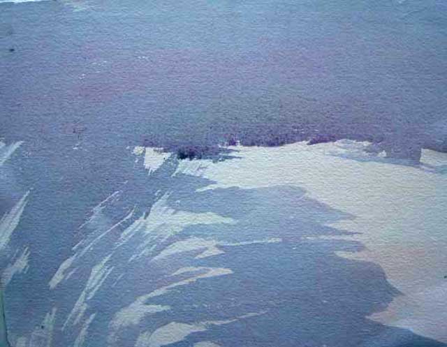 Illustration #1 Illustration #1 |
||||
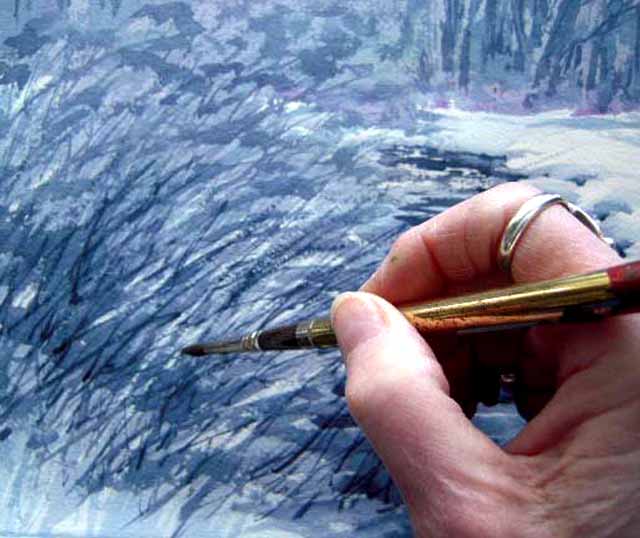
As you have always heard, you should paint the large shapes first. And this is what I have done in this picture. Because this is a monochromatic image, all the shapes are the same color and value. Next, I painted some of the background trees and the foreground branches and brush with the same wash that had made up the background. When you allow the first washes to dry, the same mix of a transparent wash can be laid over the original, which creates darker and more distinct images. This is the beauty of transparent watercolor. See Illustration #2
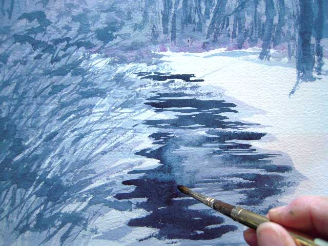
In the next three images I begin to paint the water in the stream. I lay in the darker colors of the stream. I don’t allow this to dry before I soften the edges a bit so that it is a bit blurry. Note that the darker colors are laid perfectly horizontal with no curves. |
||||
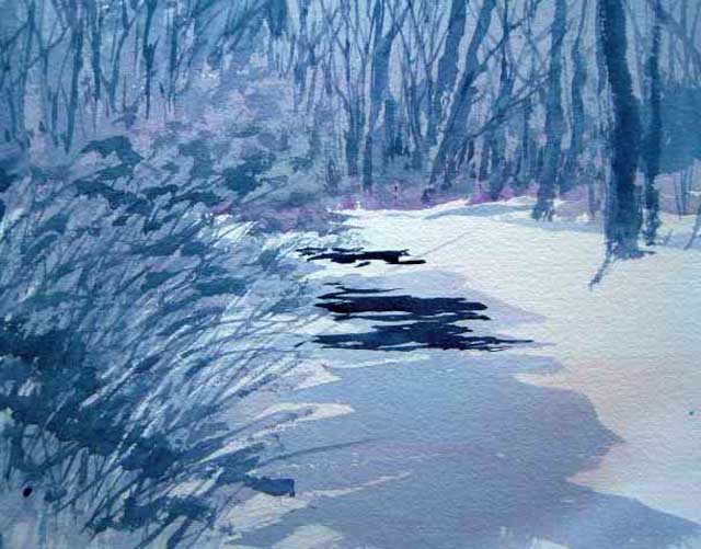 #3 #3beginning the water |
#4 painting the dark areas  |
#5 |
||
You will see in the next image, I begin to go back into the water with some tree reflections. I make soft, but darker, zip-zag lines in the wash to represent a moving current that is still reflective of the trees in the background.
|
||||
Illustration #6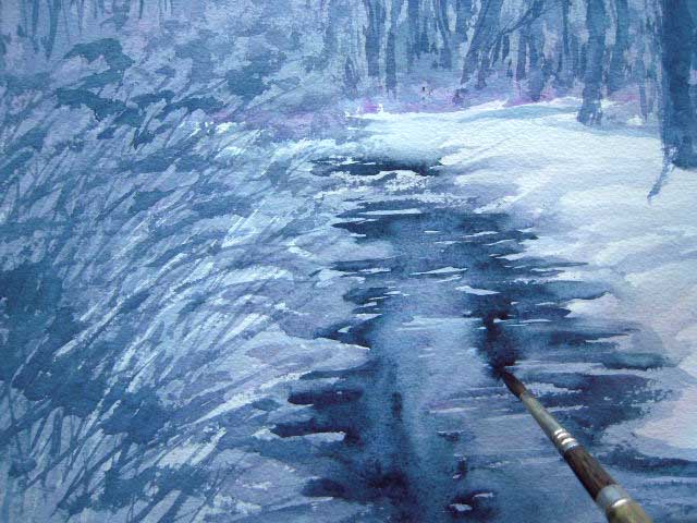 |
While the stream is still wet from softening the edges, I am able to start putting in the reflections of the trees. The wetness allows the reflections to be soft. |
|||
In these images (Illustrations 7 & 8), I intensify the values in the water reflections, added a little dark line at the base of the mounds of snow on the right side of the stream. I also paint light washes of the color up and over the bank to show that the snow is heavy and thick. Remember that shadows will help to create the swells and undulations of the snow, and also the direction that the embankment is taking. |
||||
Illustration 7 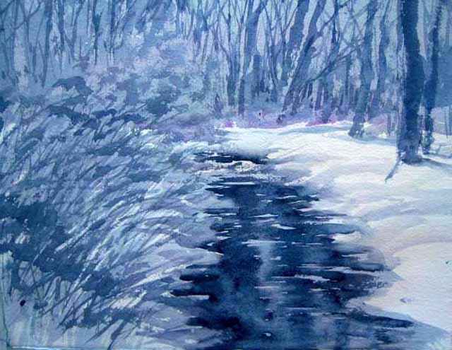 |
Illustration 8 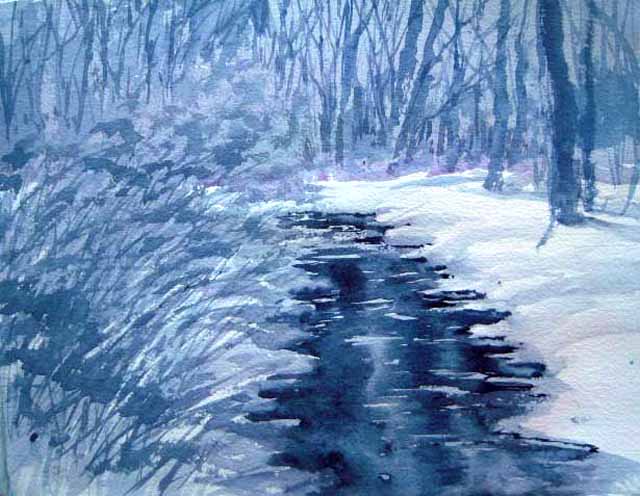 |
|||
In Detail 1, I pay attention to some of the scrubby branches on the left of the bank. This too, is painted with the same colors in the first washes. I had not made up enough of the wash to complete the painting so I had to mix more, but it was basically the same intensity as the first mixture. But because I had allowed the painting to dry, it appears darker than the other washes. This is the way you build depth with transparent watercolors. It is a form of glazing in small detailed areas. I also used this finishing technique in the background trees before finishing the painting. |
Detail #1
|
|||
Detail #2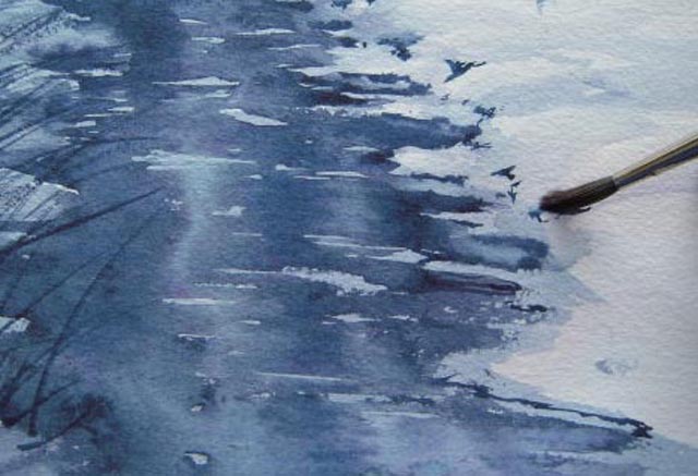 |
I saw that the mounds of snow along the bank needed a bit of “tweaking” to make them look puffier, so I added little spots of color and blended the edges to make the puffs of snow stand out. (Detail #3) |
|||
Illustration 9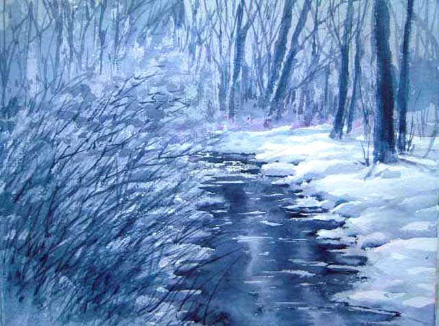 |
To create a more dramatic effect and to tie all the parts together, I added a dark wash to the background (same mixture as before!) and also to the scrubby branches on the left. In order to force the eye to the highlight (focal point) to the right of center, I also added a darker wash to the lower right edge of the stream. |
|||
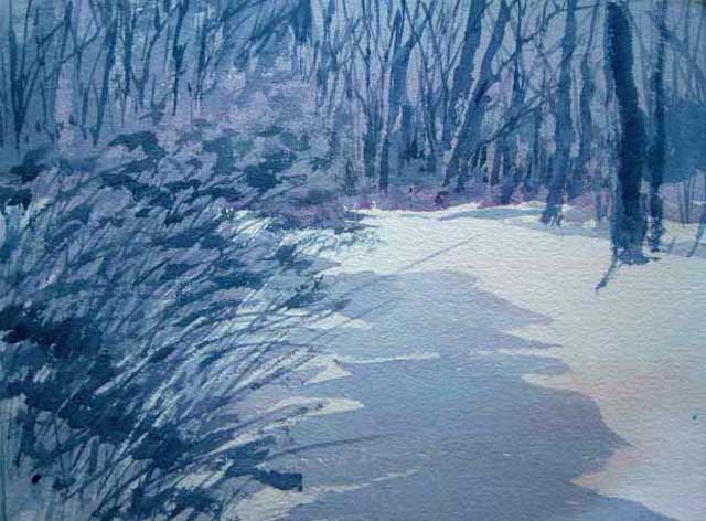
Finished painting of the Winter Stream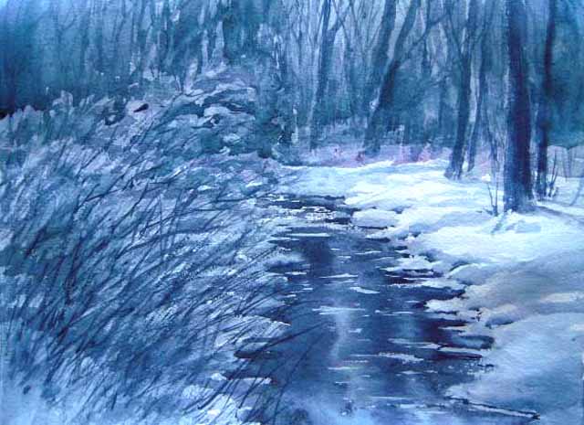 |
||||
Even though this seems to have been a one-color painting, there are actually three colors involved: Quinacridone Gold, Opera, and Cobalt Blue Hue. You can see a bit of pink in the middle ground. I find that mixing three colors gives me the flexibility of moving from warm to cool in different areas of the painting.
<<Return to Lesson 17: Graded Wash Advance to Lesson 19: Flat Wash>> Return to Watercolor Painting tips Return to Watercolor Lessons |
||||
 |
||||
|
Send comments or
questions about the artwork to art@maboysen.com |
||||